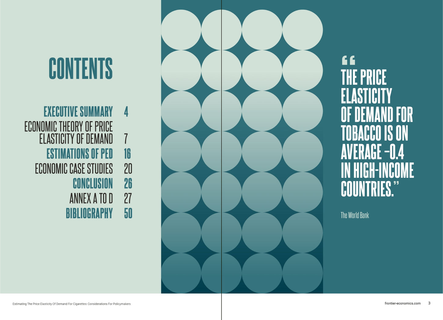
This IM design needed to follow Frontiers branding but with it's own unique twist. The challenge here was to illustrate the cigarette industry without using any imagery reference to cigarettes.
The solution was to use supersized graphic elements representing an alternative to photography about a sensitive subject.
The circles represent the stacking up of demand.
The waves highlight elasticity.
The angled lines reference
the escalating taxes.
The graduated colours add depth to these elements.


